.
.
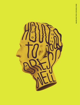
Gekrizelte Notizen
in Page 01|16
|
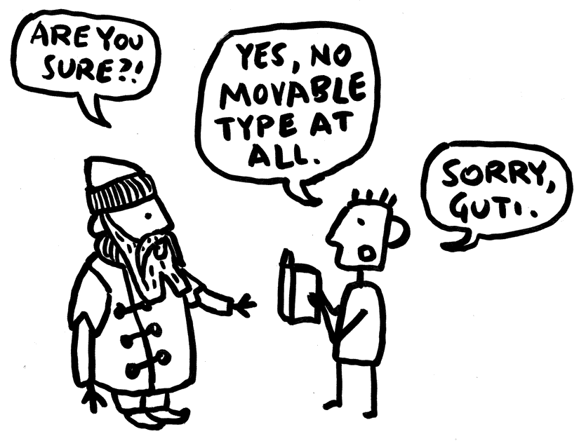
Gekrizelte Notizen Eine Illustration für die PAGE, schnell auf dem Smartphone gezeichnet …
|
.
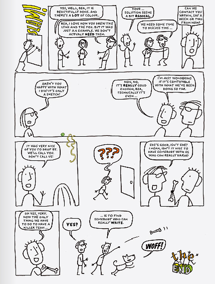
Das Killer Argument
in Page 06|15
|
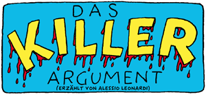
Das Killer Argument Die Page hatte vor, eine Ausgabe über Humor zu publizieren, was gut gegangen wäre, wenn sie mich nicht dazu gebeten hätten, einen Beitrag zu leisten …
|
.
Interview
Berliner Zeitung, 3. Mai 2014
|
Keine Kleinschreibung vor Karl Ein Interview über meine Arbeit an der Schrift für Berlin, die BMF Change, meine Comic und andere lustige Dingen – alles etwas durcheinander, aber immerhin auf dünnes Papier (nur in den Archiven der Zeitung) und Online. |
.
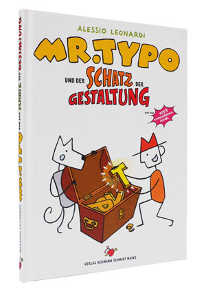
Mr. Typo
und der Schatz
der Gestaltung
von Alessio Leonardi
Verlag Hermann Schmidt Mainz,
96 Seiten, vollfarbig
Mehr als 500 Zeichnungen
und auch eine Menge Wörter.
|
Mr. Typo und der Schatz der Gestaltung So Karin Schmidt-Friderics über das Buch: |
.
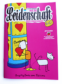
Wie die Leidenschaft
unser Leben
ruiniert
von Alessio Leonardi
2010, BuyMyFonts.com Editions
48 Seiten, komplett in S/W
|
Wie die Leidenschaft unser Leben ruiniert This comic is only available in german (at least for the moment). Sorry! Die Geschichte Ich wurde eingeladen, einen Vortrag zum Thema Leidenschaft auf der Typo Berlin 2010. Anfäglich hatte ich vor eben einen Vortrag vorzubereiten, leider klappte es nicht so wie geplant. Die Zeichnungen, die ich als Unterstützung meiner Thesis zeigen wollte, nahmen die Oberhand und zwangen mich, noch mehr Zeichnungen zu machen und noch mehr bis ich im Prinzip ein Comic Book hatte, aber keinen Vortrag. --> weiter |
.
.
.
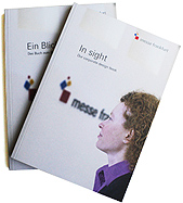
Ein Blick | In Sight
Ein Buch über das Corporate Design
der Messe Frankfurt
by Alessio Leonardi
2011, Frankfurt am Main, Germany
--> read more
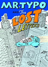
Mr. Typo
The Lost Letters
2008, Mergenthaler Edition,
Bad Homburg, Germany
with Jan Middendorp
--> read more
.
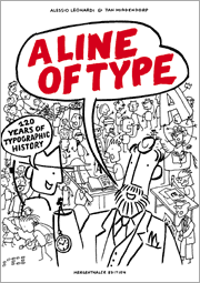
A Line of Type:
120 Years of Typographic History
2006, Mergenthaler Edition,
Bad Homburg, Germany
with Jan Middendorp
--> read more
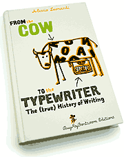
From the Cow to the Typewriter:
The (true) History of Writing
2004, BuyMyFonts.com Editions,
Berlin, Germany
--> read more.
The book can be order at BuyMyFonts.com
.
.
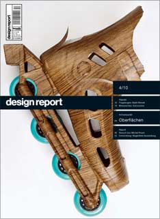
Pitch!
Design Report 4/10, 2010, Germany
For this issue of Design Report I was asked to draw a comic about design pitches. In full color!
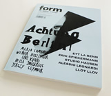
Achtung Berlin | Alessio Leonardi
Form 233, 2010, Schweiz
A special issue about design in Berlin – with an article dedicated to my work.
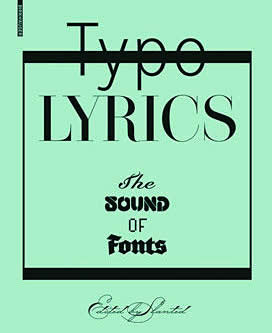
Typolyrics
The Sound of Fonts
Edited by Slanted
2010, Birchenhäuser
Basel, Schweiz
A graphic contribution: I illustrated a song using the BMF Elettriche typefaces.
Inteligence, Typefaces and Sex
in “Shaping Voices”
Oogachtend Editions
2010, Belgium
An interview, more or less.
.
.
How good is bad type?
Form 234, 2010, Schweiz
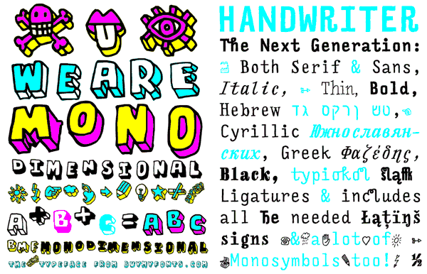
BMF Monodimensionale
and FF Handwriter
Slanted #11, 2010, Germany
 .
.
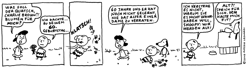
Berliner Zeitung, 2./3 Oktober 2010
For the 60th birthsday of Charles Schultz’ Peanuts, I was asked by the Berliner Zeitung to draw an Hommage to Charlie Brown and his friends.
.
Typodarium 2010
2010, Verlag Hermann Schmidt Mainz, Germany
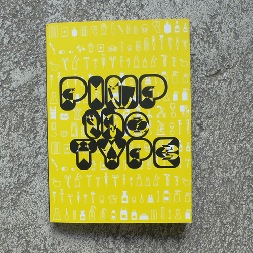
Pimp the Type
Exhibition Catalogue, 2009, Valencia, Spain
Essays
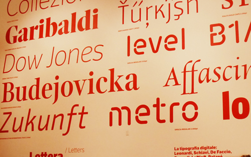
Caratteri
.
Articles about me and my stuff
.
Achtung Berlin | Alessio Leonardi
Form 233, 2010, Schweiz
.
Interviews
.
.
Exhibitions
.
.
.