.


I design typefaces since 1984 (yes, the real special year: Orwell*, MacIntosh**, if you know what I mean).

After some analogic design I made for a few small clients in Italy and the work on a huge bitmaps-font family for Siemens AG, my first digital typefaces were published in 1992 by FontShop International.
Then I worked for a long time for Linotype GmbH (beside of some typefaces we also designed their corporate identity) and founded my own fontlabel in 2002: BuyMyFonts.com.

I love to design typefaces and I do it both commercially well as for the fun of experimenting new things – creating rules or breaking them.
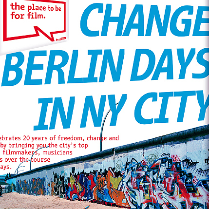
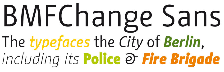
There are many typeface family I made and I love them all. But I am proud in a very special way of the BMF Change, the font family I designed for the City of Berlin.

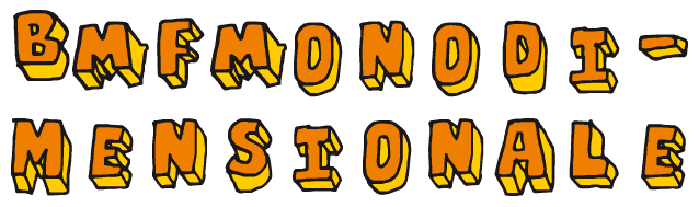
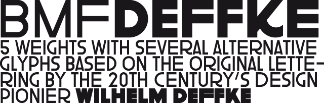
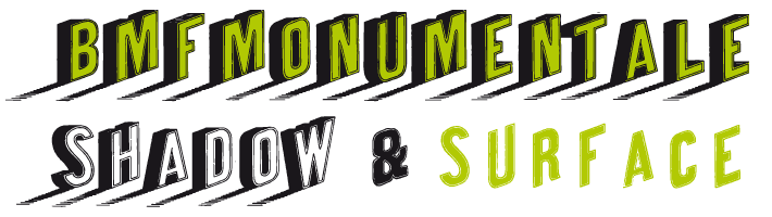
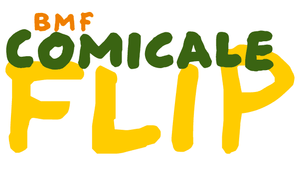
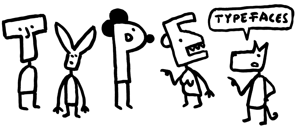
On this page I show some of my recent work – without any special order.

Useful links: * Orwell, 1984; ** Macintosh

.
.
BMF Change Sans
These typefaces were created for the beBerlin Campagne. Later they became the official type of the City Berlin, its Fire Brigade, Police and many other institutions.
--> more

BMF Monodimensionale
BMF Monodimensionale is a small hand-drawn typeface family that got its name from three important facts: at first, it is monospace (MONO-); then, it simulate a 3D effect (-DIMENSION-; and last but not least, I made it (-ALE). I love to do things that are not really full of meaning: why did I made a monospace font by hand? Becouse it looks fantastic!


--> more
.
BMF Deffke
For the beautiful book about Wilhelm Deffke, that I was lucky to design, I realized a whole headline typeface family.
--> more
.
BMF Monumentale
BMF Monumentale is based on an original design from the XIXth century that I found in a book. I digitalized it an completed the character set – that was originally very poor. The perspective and the shadows make the letters really monumental: therefore I chose the name. To complete the family I added a version with only the surface of the letters: you can combine them using different colors to make them look even cooler.
--> more
.
.


BMF Comicale
The BMF Comicale Flip is my own handwriting. I wrote a lot of words and textes, scanned them, made a choice of the letters and put the best of them in a font. With a simple script I found in my archive, I was able to realize a typeface that change randomly between different versions of the same glyphs. This allow to give textes the lively impression of handwritten letters – without to painfully have to write them all by hand.
--> more

.